I am slowly coming out of my comfort zone and I just posted my first layout to the 2Peas Gallery. I did this because I wanted to participate in the Scrapbook Stamping Class because I knew that would help me use more of my stamps which is one of my goals this year. My style isn't exactly like the rest you see there, but I am trying!! Most of my layouts are multiple photos, and I have a linear/clean line type of style. I know there must be others out there that have this type of style. Anyone??? Bueller? Sorry, couldn't resist.
Anyway, I thought I would share my layout here since I can add a lot more detail about the stuff I used and what I did.
The layout is based on my sons' first day of Kindergarten. After I started doing this layout I realized that their clothes for the day even matched and I didn't plan that! I had them pick out their own shirts. All of the stamps I used are from Papertrey Ink - School Time.
"First day of" is from a stamp, but the actual stamps says, "First day of school." I just masked the school part so I could use the rest of the stamp. Kindergarten is cup with the cricut cartridge, Plantin Schoolbook. I layered some paper to make it look like chipboard. The border of "I love School" is also a stamp.
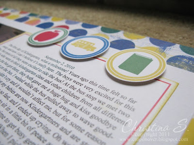
The stamps on this page are the embellishments on top, the ABC paper in the middle, and the year, age, and teacher on the bottom piece of paper. The patterened paper I used on this layout is an old one I had from my stash. It was from the Junkits Brights line. Using my stash was another goal I had, and I can say so far so good!
After I stamped these images, I used my 1 3/8" circle punch to cut them out and then I popped them up on dimensionals to give some depth.
Here is a close up view of my faux chipboard letters.
Supplies used:
Patterned Paper: Junkitz Brights
Cardstock: SU! Whisper White textured and smooth, real red, brilliant blue, daffodil delight
Ink: SU! real red, brilliant blue, yoyo yellow, daffodil delight, garden green
Stamps: PTI School Time
Other: 1 3/8" circle punch, dimensionals, computer journaling
Subscribe to:
Post Comments (Atom)


I love your style of scrapbooking...it's very similar to my own. I like that everything on your pages connect with the pictures and the purpose of the page! For me, scrapping is supposed to focus on the pictures, not on the embellishments! Great job!
ReplyDeleteThank you so much! I feel the same way about wanting the photos to be the focus! Sometimes I feel like I'm the only one left so it's so nice to hear from somebody else who feels the same way! Thanks for writing!
ReplyDelete