Wednesday, February 9, 2011

A Winter Wonderland Valentine

I mentioned a while back that I had to make my mom some little Valentine's Day cards to give to her guests at the B&B, and since her theme is a winter wonderland Valentine's, I made he some snowflakes as well.  I'm sharing today what I made for her.


This is the mini card, and she will put these in the guest rooms.
Details (most products used here are SU unless otherwise noted):
Base - 4"x3" Bashful Blue cardstock
Layer - 3 7/8" x 2 7/8" Night of Navy cardstock
embossed snowflakes - Serene Snowflakes set, versamark, Ranger Bridal Tinsel embossing powder
Ribbon - Real Red 5/8" satin
Label on front - decorative label punch in bashful blue; wide oval punch in night of navy then embossed with vintage wallpaper embossing folder; I {heart} hearts stamp set, stamped in real red, then punched out with heart to heart punch.  This label is then attached to the card using dimensionals.


Inside the heart is stamped with I {heart} hearts stamp set in bashful blue ink, but stamped off once and then stamped on the inside.  The quote is from Occasional Quotes.


I made these snowflakes using my Cricut and the When It's Cold Outside cartridge.  I made 4 different snowflakes in 3 different sizes: 2.5", 3", and 3.5"  They are double sided so the outside snowflake it cut with just plain white cardstock, and the inside is bashful blue cardstock.  My mom will hang these from the ceiling in the dining room and throughout the lobby, along with some hearts that I made her last year.  I hope she takes pictures, I would love to see it all put together!

Monday, February 7, 2011

Tip for Today

I'm still trying to catch up on some stuff and I end up catching a cold!  I've been slacking on some of my goals I wanted to achieve this year, and I'm pretty sure I need a lesson in time management. 

For now I have a small little tip.  I'm sure others do it this way too, but sometimes I can be a little slow in figuring these things out for myself!  So how many people get frustrated with their paper trimmer cutting crooked?  Yup, me too!  Well, one day I was sitting there trying to figure out what could be possibly causing this problem.  I have 2 different kinds of trimmers and they both were cutting crooked!  As I was cutting a piece of paper, I noticed that as soon as I started to slide the blade down, my paper shifted.

Let me try to explain in pictures:
When you have the paper at the top of the trimmer and you slide the blade from the top down, it can very slightly push the paper to the left.  Yes, even when I hold down the paper, for some reason it still moves it very slightly, enough to notice that there was a difference in size from the top of the paper to the bottom.  I wondered if it was because there wasn't anything at the bottom of the paper to hold it in place.


So I thought what if I cut from the bottom going up?  If I did this, then the paper would be held against the lip at the top of the trimmer and it might keep the paper in place while I cut the paper.  Well, it worked!  With having that paper against that little ridge, it kept it in place while I pushed the blade through the paper.


It also works if you put the paper at the bottom of the trimmer (if there is a lip there also) and then cut from the top to the bottom.  As long as there is something that prevent the paper from slipping to the side while you cut it.


Since I've been doing it this way I haven't gotten any crooked cuts and my frustration level against paper trimmers is way down!

Now if somebody can give me some tips on how to stop getting these huge spaces in my blog posts, my frustration with blogger will go down as well! haha  What am I missing???

Wednesday, February 2, 2011

My Version of Project Life

I know many are doing (or have done) some form of a picture a day type of project.  Some document their lives by taking a picture everyday, some do it weekly, and some do it monthly.  There really is no right or wrong way to do this, it's basically just what you prefer!  Back in 2009 I tried to do the picture a day, then called Project 365.  At first I didn't miss a day.  Then I would miss maybe a day or two a month.  Then it turned into a day or 2 a week...well you  get the picture!  I continued to take pictures throughout the year, but it definitely wasn't everyday.  My intention was to do the album digitally in 8x8.  So I had a couple layouts done for January, but then I got behind on the layouts.  I continued to file my pictures into the appropriate monthly folders, but never did the layouts for them.  Recently I was going back through the layouts I did and I can't even convey the emotions I felt and how nice it was to look back at those pictures and remember those moments that most likely would have gone undocumented, especially those of my sons.  After falling so behind back in 2009, I always thought I could never commit to doing another one of these types of projects.  Suddenly after looking at the beginning of my 2009 Project 365, I really wanted to try it again this year.  I decided to do it digitally again, but this time I didn't want to do a separate album and have each 2 page spread be one week.  I wanted to try to incorporate these pictures into my family scrapbook, but not take up too many pages...oh the dilemma!  Sooooo, I ended up making my own digital template, based on Becky Higgins Project Life, with a tweak here and there to fit some portrait pictures.  Then all I had to do was drop in my pictures and add my journaling.  The templates I made are in 12x12 size, but I am going to resize it to 6x6, and I will be able to fit a whole month on a 2 page layout.  Here is what I mean...


These are 2 separate pages, which make up 1 week.  When resized to 6x6, they fit next to each on a 12x12 page.  The next week, I did the same thing and those 2 pages will be next to each other and will fit under the previous week pages, making up the left side 12x12 page, looking like this...


I did the same for the following 2 weeks of January, which will then be on the right side 12x12 page, and look like this...


So all together the full 2 page layout, which covers the month of January looks like this...


I hope this made sense, it's a bit confusing to explain.  The paper I used for January was Echo Park digital Wintertime Collection.  LOVE Echo Park!!!  I just love that I can fit the whole month, day by day, on just a 2 page layout and it can go right in with my regular family scrapbook, where I can still have my traditional layouts as well!  I love that I can feel like I have these memories already scrapbooked and not feel like I'm behind yet another year. 

Friday, January 21, 2011

Projects, projects, and more projects...

...but no pictures to share yet.  Sorry!

It has been quite the week!  My sons had no school on Monday because of the holiday;  no school on Tuesday because of snow and ice; delayed opening on Wednesday; regular school day Thursday; again no school today, Friday, because of more snow.  It's been a looooooong week!

In the meantime I am trying to get a whole lot of projects done.  Some are my own, others are for other people/events.  Some of my own have been organizing my digital pictures for my scrapbooks.  I've been slacking on that lately so I am way behind.  Another of my own projects is trying to organize my recipes.  I've been wanting to make my own recipe book for a while now, but I just can't seem to make the effort to do it.

One of the main things I'm working on are some Valentine's Day cards for my mom.  The bed and breakfast she manages has an annual valentine's day party and she likes to make it personal.  I did some projects for her last year, you can see them here.  This time I just have to make the cards and some snowflakes.  I will be sure to post some pictures once I'm finished.  Oh, and if anyone is looking for a great place to go on vacation and a wonderful place to stay, you can always check out The Castle Bed and Breakfast!

Another main task I am trying to manage is the school carnival.  I am on the committee for putting it together and this is my first time doing anything like this.  I am super excited, though, and can't wait to start putting things together.  Right now everything is still in the planning phase.

It sure seems like there are times when I have nothing at all going on, and then the next thing I know I have way too much happening!  Hopefully I won't get overwhelmed and will be able to accomplish my goals.  I also want to keep up with my own scrapbooking.

Tuesday, January 18, 2011

First Day of Kindergarten Layout

I am slowly coming out of my comfort zone and I just posted my first layout to the 2Peas Gallery.  I did this because I wanted to participate in the Scrapbook Stamping Class because I knew that would help me use more of my stamps which is one of my goals this year.  My style isn't exactly like the rest you see there, but I am trying!!  Most of my layouts are multiple photos, and I have a linear/clean line type of style.  I know there must be others out there that have this type of style.  Anyone???  Bueller?  Sorry, couldn't resist.

Anyway, I thought I would share my layout here since I can add a lot more detail about the stuff I used and what I did.


The layout is based on my sons' first day of Kindergarten.  After I started doing this layout I realized that their clothes for the day even matched and I didn't plan that!  I had them pick out their own shirts.  All of the stamps I used are from Papertrey Ink - School Time.


"First day of" is from a stamp, but the actual stamps says, "First day of school."  I just masked the school part so I could use the rest of the stamp.  Kindergarten is cup with the cricut cartridge, Plantin Schoolbook.  I layered some paper to make it look like chipboard.  The border of "I love School" is also a stamp.


The stamps on this page are the embellishments on top, the ABC paper in the middle, and the year, age, and teacher on the bottom piece of paper.  The patterened paper I used on this layout is an old one I had from my stash.  It was from the Junkits Brights line.  Using my stash was another goal I had, and I can say so far so good!


After I stamped these images, I used my 1 3/8" circle punch to cut them out and then I popped them up on dimensionals to give some depth.


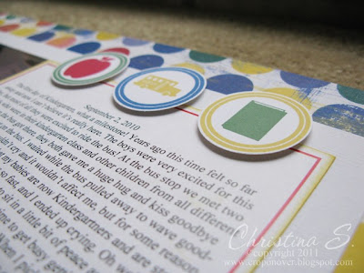
Here is a close up view of my faux chipboard letters.

Supplies used:
Patterned Paper: Junkitz Brights
Cardstock: SU! Whisper White textured and smooth, real red, brilliant blue, daffodil delight
Ink: SU! real red, brilliant blue, yoyo yellow, daffodil delight, garden green
Stamps: PTI School Time
Other: 1 3/8" circle punch, dimensionals, computer journaling

Monday, January 17, 2011

Bags from Plantin Schoolbook

I tend to be a visual person and I like to see how things are, so I seem to make myself a lot of reference type sheets.  A while ago I needed to package up a gift quickly and had nothing at home to use.  I thought I would make myself a bag from one of my cricut cartridges, but I had no idea how each one would turn out or how much room inside there would be.  So I thought once I had the chance I would cut out each bag and make myself a little reference sheet.  If I am going through all this work for myself, why not share it!

I started with Plantin Schoolbook since they only had a couple, and I already posted my font reference sheet and end cap reference sheets in the past.  I might even do the envelopes for this cartridge as well.


I cut these out with an 8.5x11 sheet of paper and chose fit to page to cut at the maximum size, but I got the maximum size cuts for 12x12 and 24x12 as well.  I also included the measurements of the put together bag, but on my reference sheet I forgot to mention that the size of the completed bag was for a bag made with 8.5x11 paper and not the bigger sizes.

This is the main bag
Maximum cut sizes:
8.5x11: 6.5"
12x12: 7.25"
24x12: 11.5"
Height to top of bag: 4 3/8"
Height to top of handles: 5 5/8"


Shadow of main bag - this one has no cut lines or score lines.  I had to make my own
Maximum cut sizes:
8.5x11: 6.25"
12x12: 7"
24x12: 11"
Height to top of bag: 4 1/2"
Height to top of handles: 5 5/8"


Tall Ball
Maximum Size cuts:
8.5x11: 9"
12x12: 12.5" (don't know how, but that's what it gave me!)
24x12: 13"
Height to top of bag: 3 5/8"
Height to top of handles: 4 3/8"


Italic
Maximum size cuts: 
8.5x11: 6.75"
12x12: 7.5"
24x12: 11.5"
Height to top of bag: 5 5/8"


Roly Poly
Maximum size cuts:
8.5x11: 5.75"
12x12: 6.25"
24x12: 11.5"
Height to top of bag: 3 5/8"
Height to top of handles: 4 3/4"


I took this picture to show that pretty much all the bags have the same size inside of them, which is about 1 1/4" except for Tall Ball, the round on at the end.  That one is about 1 3/8"


This is a picture of what the reference sheet looks like.  I am going to attempt the put a link for the PDF here in case you want to print it out for your own reference.  Since I never tried to link to a PDF before, please be patient if it doesn't work.

Also remember that the size for the height of the completed bags is based on a cut from an 8.5x11 sheet of paper.  I forgot to put that on the sheet.

Friday, January 14, 2011

Best Wishes

I was working on something I wanted to post today, but I have a bit of a bad headache, bordering on migraine.  I wasn't able to finish it up yet, so I found a card a made a while ago that I haven't posted yet so I will share that today and hopefully I can get my other project done in time.


I originally made this card because I was challenging myself to use some stamps I had but never used.  That would be the flourishes I used for the background.  They are an old set from Autumn Leaves.  The color of the ink and cardstock is Almost Amethyst, retired, from Stampin' Up.  The ribbon is black satin from SU also and so is the Best wishes sentiment stamp, frame, and punch.  I need to find out the name of the stamp sets.  I'll have to come back and edit this once I find out.  I love this color and was so sad when SU decided to get rid of it :(  My favorite color is purple!
Blog Widget by LinkWithin